Top 10 Sites for Designers: May Website Design Inspiration
In this month’s list of resources for website design inspiration, you’ll find awesome virtual reality projects, info on classic design principles, and a logo design resource.
Origen: Top 10 Sites for Designers: May Website Design Inspiration
1. The Next Rembrandt
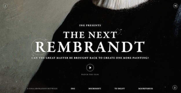
The Next Rembrandt is an incredible art/film project that sought to create a new work “by Rembrandt,” so to speak, using data from his paintings. The research that went into this project is astounding: The team behind it (from ING and Microsoft) started with all of Rembrandt’s portraits—because he painted more of those than any other style—and narrowed down the time period, demographics, elements and even head direction of the subjects in the paintings. “After studying the demographics, the data lead us to a conclusive subject: a portrait of a Caucasian male with facial hair, between the ages of thirty and forty, wearing black clothes with a white collar and a hat, facing to the right.” The sleek website and accompanying film offer some incredible insight into the project and process.
2. Nosaj Thing
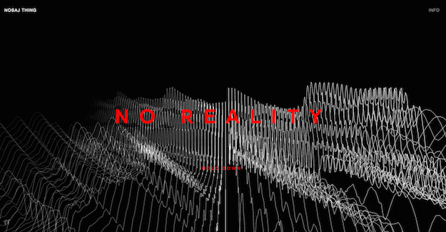
Take a moment to plug in your headphones before you visit this site. Nosaj Thing is an L.A.-based record producer who has produced tracks for Kendrick Lamar, Kid Cudi and Chance the Rapper. The surreal, high-contrast website design features a minimal but mesmerizing visualization of the music that plays upon each visit. This one in particular piqued my interest in the intersection between experimentation in the music industry and web design.
3. New Design Principles
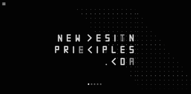
This website, created by PWW’s Team Beagle, “built on exploring future knowledge, ideas and creating discussions” features an examination of Dieter Rams’ 10 design principles. Featuring thoughts from Team Beagle and the design community and a form to enter your own ideas, the website questions the modern-day relevance of Rams’ principles and proposes its own. Interesting animated typography and thought-provoking insights abound.
4. Plane Site
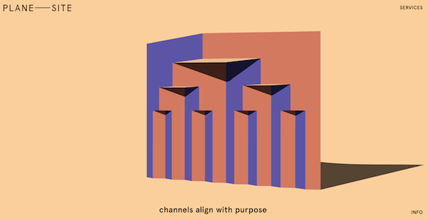
I had to play with this site a bit before I figured out the functionality of the initial “slideshow,” but I expect that’s rather the point. Part interactive art project, part portfolio site, it held my interest with its pastel color scheme, playful use of “planes” in 3D space, smooth animations and unassuming typography. Plus I’m a sucker for visual puns.
5. MarkMaker
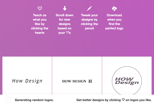
For designers, this is an intriguing inspiration tool that generates a vast array of logo designs. That is, we hope that’s what it’s used for, rather than a replacement for professional design work—but that seems to be the case. After all, the most interesting feature of this site, to me, is the algorithm it uses to refine the selection based on what you “like.” In the process it “attempts to understand the visual vernacular associated with logos for different kinds of companies.” In that case, MarkMaker could be an excellent source of design research given a bit of time. It’s part of the Emblemmatic project, which explores symbols and their meanings via other generators including Atlas of Potential Nations and Emojimoji.
6. The NASA Graphics Standards Manual
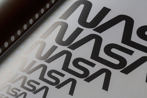
Pentagram designers Hamish Smyth and Jesse Reed recently led the charge to reissue a gorgeous hardcover edition of the National Aeronautics and Space Administration Graphics Standards Manual. That’s NASA, in case you glossed over the title. Back when the manual was merely a sparkle in the eye of its creators, I wrote about Kickstarter that launched the project over at printmag.com, noting that the book—originally designed by Richard Danne and Bruce Blackburn of the New York design firm Danne & Blackburn in 1974—documents the evolution of brand standards for NASA’s logotype known as “the Worm.” As a result of the 1972 launch of the National Endowment for the Arts’ “Federal Graphics Improvement Program,” which aimed to improve visual standards across government agencies, the Worm was designed to replace NASA’s previous—and current—logotype known as “the Meatball.” The website explains more.
7. Make It Bright
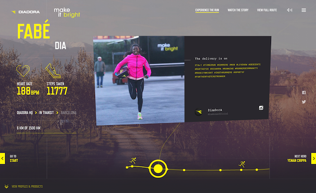
Brilliant storytelling and an impactful aesthetic—complete with smooth animation, stellar photography, impressive type, great video—unite to create Diadora’s deliciously energizing ad campaign. “Make It Bright” was launched with a 1,500 km relay across Europe in which 70 runners of 10 nationalities toted a box of shoes from the Diadora Headquarters in Italy all the way to Barcelona, Spain—all in a quest to “turn something ordinary into something extraordinary.”
8. Nurture Digital
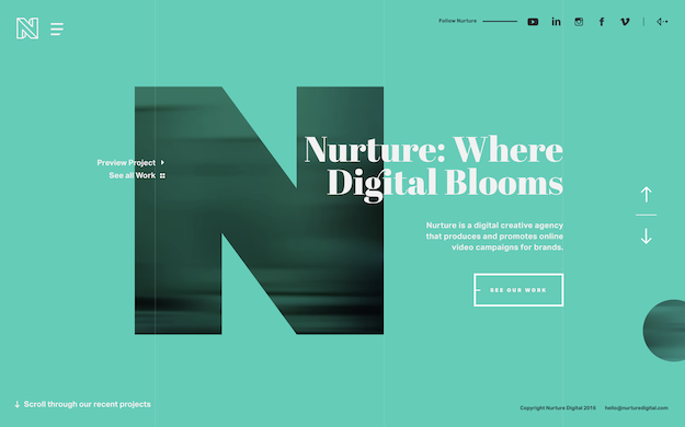
I came for the interesting combination of audio and video elements and stayed for the animated typography. The website for creative agency Nurture Digital throws a bit of everything at you, including testimonials, interesting animations and bright color schemes.
9. Color Lisa
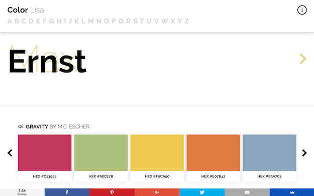
That’s Color Lisa—like Mona Lisa. But wordsmithing appreciation aside, this website is pretty darn cool. “A curated list of color palettes based on masterpieces of the worlds greatest artists,” Color Lisa is an intriguing, beautifully-designed and surprisingly helpful resource for designers, fine artists and those smitten by their work. Select an artist’s name from the alphabetical list to see a breakdown of the color schemes used in select works. This project is the work of artist/photographer/designer Ryan McGuire (one of whose websites can be found at the cheerful laughandpee.com).
10. Virtual Art Sessions
virtualart.chromeexperiments.com
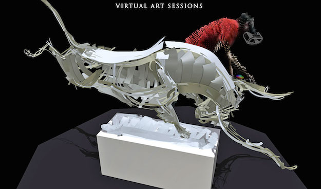
Explore as six world-renowned, diverse artists paint in virtual reality from any angle. I would explain more, but the experience says more than I can. (Works best in Google Chrome).